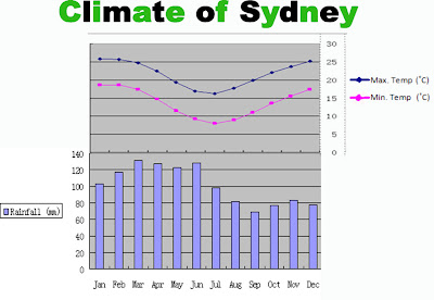
I checked with Ms. Zhang today, some parts of my draft were wrong. So now I've done it again and am posting it. It was not actually that hard to put the y-axis of the temperature on the right hand side - I just made two copies of the graph, then cropped one so that only the scale remained and then grouped the scale with the other graph (which, of course, has to be cropped so that the original scale is not showing). Although it sounds real easy, it took a lot of adjusting and other stuff. And the temperature graph is less clear than the rainfall one (only slightly), maybe because I screen shot it too many times (it's real useful to put together two images that you can't otherwise put together). But the exercise is really meant to test our uploading skills so I thought it's alright (plus it's only a little unclear).
And the image can be enlarged by clicking on it.

